Exhibit A: (For a brain refresher, click HERE to see what my entryway looks like. It's sad to me that it's sat like this for almost 2 years. I'm working on it) What I'm trying to do is make a gallery wall of picture frames on the right side when you walk into the entryway from the front door. I'm trying to put a gallery wall on the right side of the entryway closet. This is the space I have to work with.... It's basically 44" tall by 57" wide.
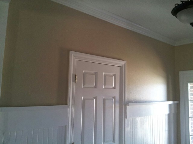
My basic idea is to make the entire wall, even around the top of the door, a gallery wall. I want the lines on both sides of the door to match, so I am limited to the height that I work with on either side. Because the area above the door is so slim, I'm thinking that I'll probably put two rows of square picture frames up there.
Below are all the different arrangements I've come up with so far for the right side of the wall (the reasons that I like/don't like them are below each image.).
Below are all the different arrangements I've come up with so far for the right side of the wall (the reasons that I like/don't like them are below each image.).
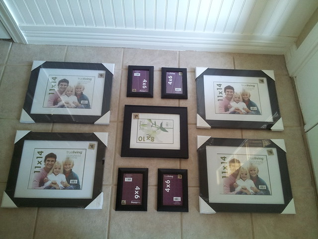
option 1: this was the first arrangement I created. I like it, but the problem with it is that it's not that tall, so it may not line up evenly with the frames I plan on placing on the other side of the door (same wall), so this one got nixed fairly quickly. But maybe I shouldn't worry about the other side of the door and just treat those areas as two separate areas instead of one big wall?
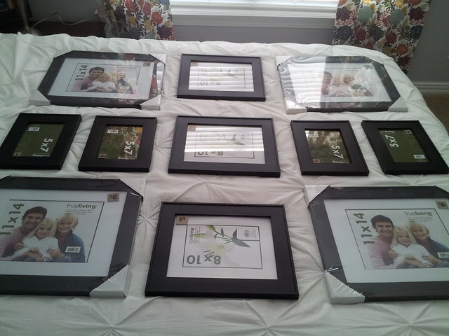
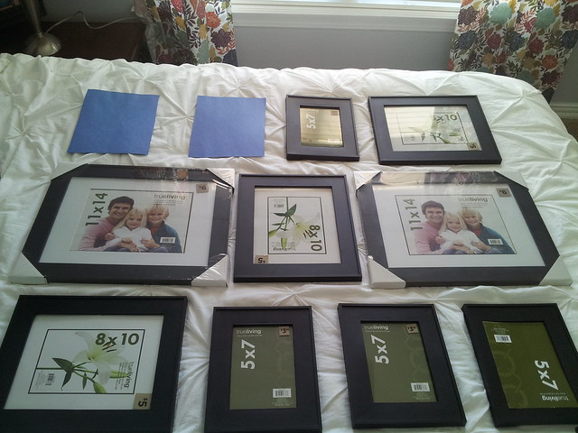
option 2: I actually have two versions of this layout. This one, and then one where I put the middle 8x10 frame laying vertically instead of horizontally. My concern with this layout is that there may be too many big pictures for me to fill (the 11x14 frame is matted to 8x10).
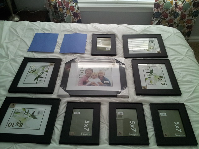
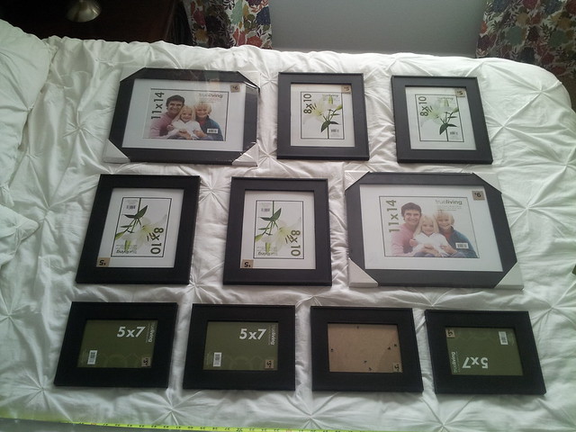
option 3: The commentary I get on this arrangement is that there isn't enough of the bigger size picture. I personally like this arrangement.
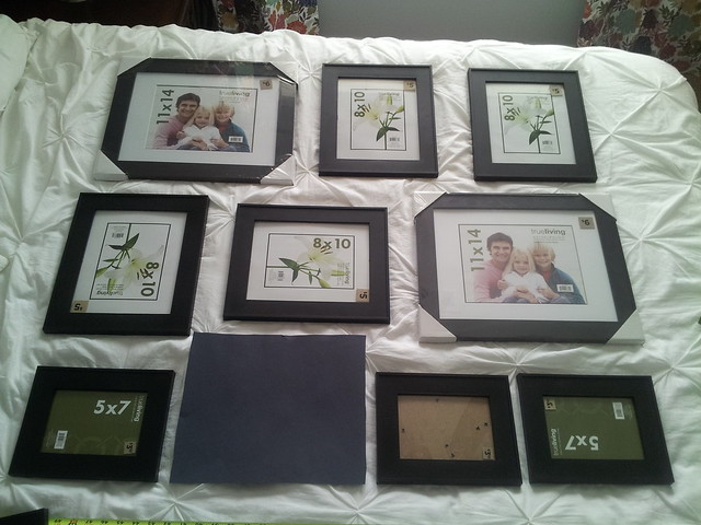
option 4: this is probably in my top two of the arrangements I've come up with. I like how it has a focal point 8x10 (thinking I could put a bible verse typography type of artwork in that frame), and isn't overloaded with the 11x14 frame.
option 5: not sure what to think of this arrangement. My friend said it looks like the 5x7s kind of got put onto it as an afterthought. I think she's onto something.
option 6: this one is in my top 3, which even surprises me. It's not as symmetrical as the others, which some people like. Personally, I'm a bit of a symmetry freak, so I have to get over the fact that it's a little odd on the symmetry side.
SO... someone with interior decorating skill tell me... which one should I pick, and why? Or does it really matter? I've asked a lot of my closest friends, and I get all sorts of responses, leaving me to wonder if gallery walls are more of an art of opinion than fact. Guess the answers I get in the comments of this post will tell me :)